I don't think I've ever gotten around to featuring it on the blog before, but here's the crown jewel of my childhood collection, a 1969 Topps Reggie Jackson rookie card.
That's it for this time.
I don't think I've ever gotten around to featuring it on the blog before, but here's the crown jewel of my childhood collection, a 1969 Topps Reggie Jackson rookie card.
That's it for this time.
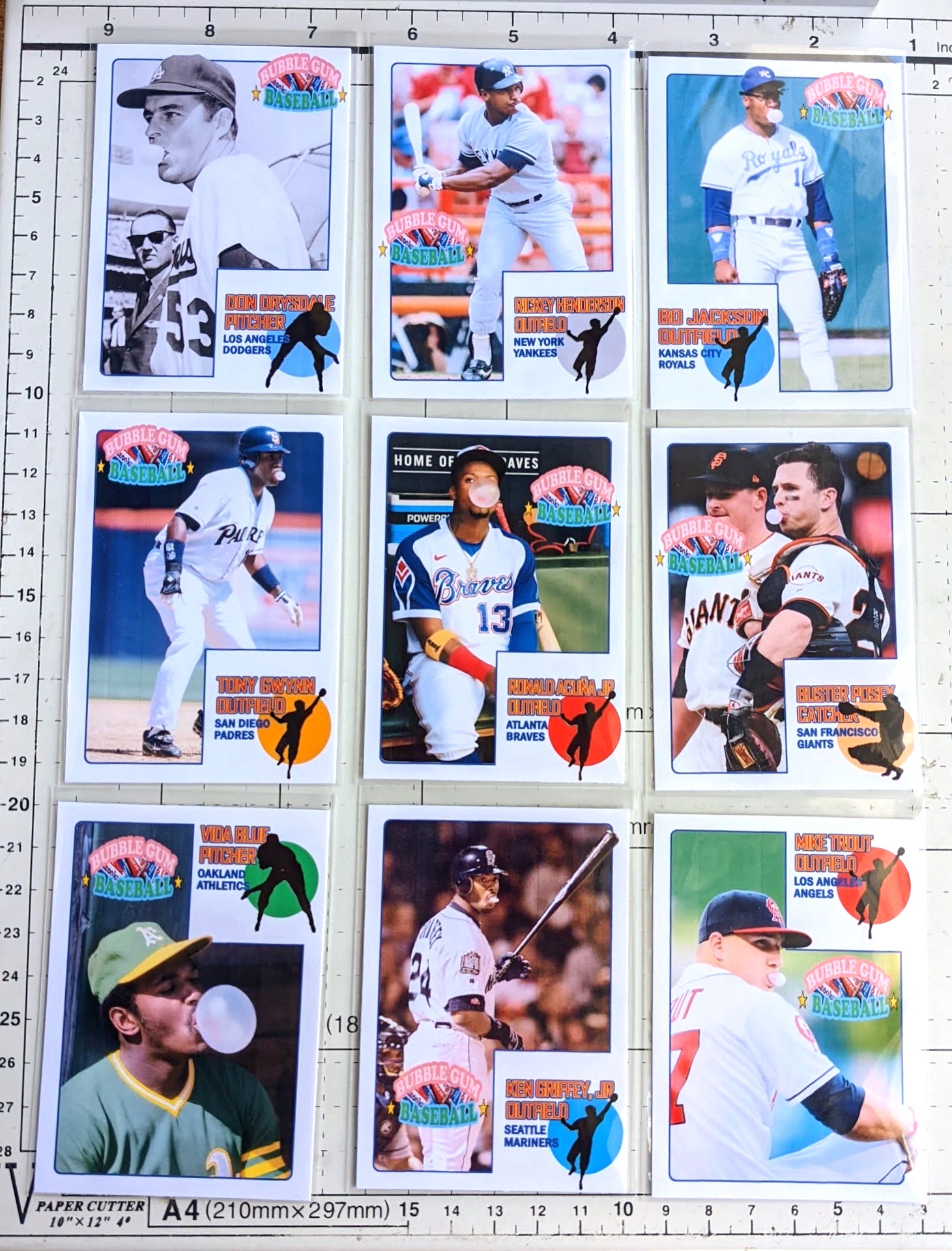
Once I finally got back into the groove of making customs earlier this year, my first order of business was to make a few cards with bubble-blowing photos for Bob at Best Bubble, whom I needed to thank for some cards he sent me spread over the prior several months.
Usually when I make customs, I'm borrowing a known design, like a classic Topps design or something oddball from the junk era. But I decided to try coming up with a "new" design for this project. That's not my strong suit, but I think the cards came out pretty decent. I like going with 9 cards total for convenient paging.
This is a fun group of cards, yeah?
My "new design" ended up looking like more of a mashup, but with the thousands of sets out there at this point, it's not easy to come up with something fresh. Can you identify some familiar aspects? Here's a closer look:
The name plate area is an allusion to the packaging of Big League Chew, while at the same time paying homage to my personal favorite Topps flagship set, 1973. I decided to use the color dot to roughly match team color rather than keep it assigned by position, mainly because I knew I'd end up with several outfielders and I wanted more variety than a bunch of green dots.
The Bubble Gum Baseball logo is a little busy, but it provides all the backstory you need to understand what the set is all about. (I tried seeing how it looked without it, but it made things look a little too straight "1973 Topps" [instead of the subtle "1973 Topps" look I was going for].)
I'm not taking these to a professional printshop or anything, just using photo paper on my streaky old Canon home printer, so they're not perfect-- the digital files look better than the printed versions-- but good enough.
The backs have a little write-up captioning the front picture, often revealing added significance to them, such as the fact that the Trout photo was taken during warm-ups before his very first game in the bigs.
The first 6 of these were made a month or two ago, and then more recently I finished out the page with the bottom 3. My plan is to stop here, at least for this year, but may whip up a "Series 2" next year if there's interest. I would likely tweak the design a bit for future editions, but keeping a similar look.
Want any of these in your own collection? I don't sell customs, but can usually be talked into trading. My top priority at the moment is 1972 Topps baseball. If you've got any 1972 Topps on my wantlist available-- especially high numbers-- I'd be interested in working out a trade with you. I'm still aiming to finish 1972 by the end of the year-- you know, to commemorate its anniversary or whatever-- preferably through trading more than purchasing, and you can expect to see more "trade bait" on the blog fishing for '72s coming up this year. So when you guys go to card shows or whatever, keep an eye out for good deals on '72 high numbers to get and then trade to me! lol
Oh, and there's a special parallel. Get ready for this.
I haven't actually finished creating them yet, but each card theoretically may have a pink parallel. But the color of the border isn't the main draw with these parallels. I think I'm still in the "prototype" stage with these, but if Blogger with cooperate and let me share a video, it'll give you an idea of what I'm going for...
There's a "real bubble"! Let's see Topps or Panini do that! I gotta say, the bubble is fun to play with.. just squeezing it a little and knocking it around for a moment is very satisfying. It'll most likely deflate over time, but my earliest tests from over a couple months ago are still looking just as good, so hopefully plenty of time goes by before the bubble goes flat. I toyed with shoving in a cotton ball to help it keep its integrity long term, but that makes it clumpy and less fun. So I guess I'll just consider them "living" cards that may change over time as the bubble slowly deflates.
These pink parallel bubble cards are a pain to make, so forgive me for being stingy with trading them, but you could pry one away from me if you happen to have '72 Topps superstars I need. (I'd specifically love to score any of these big needs: 49 Willie Mays, 299 Hank Aaron, 300 Hank Aaron IA, 309 Roberto Clemente, 310 Roberto Clemente IA, 550 Brooks Robinson, 559 Pete Rose, 595 Nolan Ryan, 600 Al Kaline, 620 Phil Niekro, 686 Steve Garvey, 695 Rod Carew, 696 Rod Carew IA, 751 Steve Carlton TR, 752 Joe Morgan TR, 754 Frank Robinson TR, 761 Ben Oglivie/Ron Cey RC, 777 Hoyt Wilhelm.)
Thanks!
Captain Ahab: The Story of Dave Stieb is a new 4-part documentary up on YouTube. Oh man.. So, so good. I knew of Dave Stieb as arguably the best pitcher of the 80s yet who often got short-changed, but the doc shines light on some incredible storylines that either slipped by most baseball fans or were quickly forgotten as the game of baseball rolled along. I don't watch much sports-related stuff on YouTube these days, and my attention span for "deep dives" makes it tough for me to stick with longer stuff like this, but this was right up my alley. It balanced stats and humanity of the game well, with countless fascinating coincidences and one-in-a-million outcomes peppering the path of Stieb's unlikely career.
There's heartbreak, with Stieb having some brutal hard-luck baseball moments, and not getting a whole lot of respect outside of Toronto despite modern stats showing he deserved better, particularly in regards to Cy Young voting. But by the end I was misting up a little with happy tears. It's just a great baseball story and well-told by the guys at Dorktown/Secret Base.
But dang it.. I, too, am guilty of slighting Dave Stieb.
Over the history of this blog, it's been my M.O. to do a post featuring any new 2004 Topps Retired refractor auto as I get them. They've been my top collecting goal of the past several years, so it's always a big deal for me to knock another name off the list (Currently down to just Trammell). But back in September of 2016 when I harpooned "Captain Ahab" here... welp, that happened to arrive just as a big COMC delivery was being parsed through, and left me with too many things to blog about and eventually refractor Dave just got filed away without ever getting the salute on the blog he was due.
Better late than never, right?!
While the doc may have helped push Stieb's name back into baseball nerd conversations, doesn't look like his hobby love has seen much of a bump. But perhaps the members of the Hall of Fame's Modern Baseball committee will catch the doc and help atone for the sins of baseball writers past by at least giving him a closer look and seeing the story beyond what the back of a baseball card can tell you, and who knows, maybe they'll even let Dave slip into Cooperstown along with should-be-shoo-ins Lou Whitaker and Bobby Grich. But I hate getting too hung up on tired HOF debates. Bottom line is I'd recommend any baseball fan check out the documentary if you're into that sort of thing.
My project of compiling a set of Bundy family "1989 Pro Set" autographs took another step towards completion with the recent addition of David Faustino.
To refresh your memory, I ponied up for a Leaf autograph of Ed O'Neill last year after long pining away for an "Al Bundy football card autograph", and later made a matching custom overlay for a Christina Applegate auto card I picked up. And now I've gone and done the same for Mr. Faustino.The card ran me about the ol' "price of a blaster" shipped and the seller even threw in the like-new one-touch. Also worth noting that the card is serial-numbered out of 200 on the back but the listing neglected to mention it. Works for me.
Now the elephant in the room is Katey Sagal as Peg. Here's what eBay currently has available, sorted by cheapest:
Yep, the cruel irony is that the least-expensive of her auto cards all horizontal, on-card autographs... which under normal circumstances I would much prefer over any stickergraph. But for this particular project, a horizontal card would just be too awkward to try morphing into a 1989 Pro Set card. She does have some stickergraphs on the market that would work, though, so I'll just have to have some patience for one to show up at a decent asking price. Hopefully that doesn't take too long and I'm able to wrap up this project soon.
Thanks for stopping by and have a great weekend!
I sort of haven't really posted here in a month, seeing as the dumb April Fools post and most of the Sunlight vs. Cards post were drafted earlier in the year, before my previous post which was back on March 6th. Back then we were still in the thick of the MLB lockout, so a lot has happened since!
I've started a new post a few times since then, but with the exception of the latest 1991 MusiCards Blog post, they've devolved into long ramblings whenever I try to type up a little "How I've been doing lately" section and then I'm not happy with it just scrap it and eventually start over a few days later. But the bottom line is I've "stepped back" a bit, specifically from Twitter. Thanks to the social media hiatus, I'm more out-of-the-loop than I'm used to being, but my anxiety levels are much more manageable.
Anyways, here are a few recent pickups of mine.
I've got an eBay search set for a few "big cards" I still need for my 2004 Chrome black parallel set that keeps crawling along. Big Papi is a good one to secure, and of course '04 was a big season for him and the Sox.
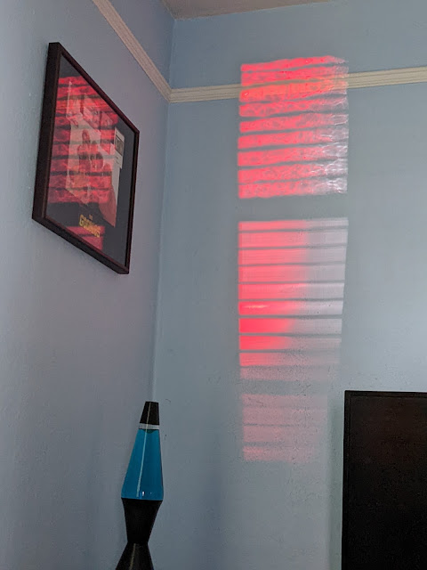
One day the sun bounced off the brake light of a car parked outside that shot some crazy red light through the blinds for a spell. (And in light of my last post regarding sun and cards, I'm getting nervous about my Goonies display and might have to rotate in something else for that spot soon.)
Probably a good one to end on. Thanks for reading!
The dormant Pack War blog by Corky used to do a neat series of "things done to cards (so you don't have to)" or something like that where he'd bury a card in the ground for a year to see what happens to it.. stuff like that.
Along those lines, I wanted to do some first-hand experiments taking a look at the effects of sunlight on trading cards.
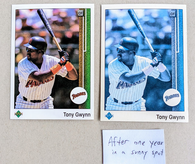
Back on 2/28/2021, I placed a duplicate of Tony Gwynn's 1989 Upper Deck in a window that gets a lot of direct sunlight, curious to see how faded it'd get after a year. I took a photo a year later on 2/28/22:
-o-
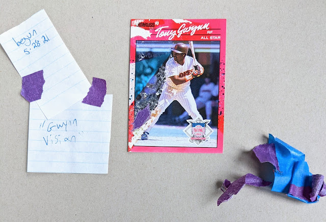
Not too long after putting the 89UD card on the windowsill, I got creative with another "card in the sun" idea. This time I blocked part of the card to try to limit the sun-bleaching to a certain area. I wanted to make a 1990 Donruss card look like there was a "vision beam" from Tony's eyes. I'm sure there are more interesting things that could be done with this concept (like, stencil out a Padres logo over the card or something?), but hey, it's just a rough test.
-o-
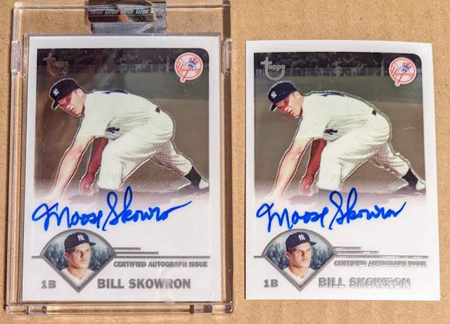
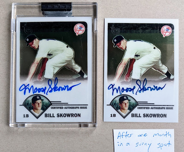
Finally, I've been intrigued by how the ink on Topps Retired autographs seems to vary with cards on the secondary market. This auto-per-pack product had 3 releases, 2003-2005, and has been a collecting focus of mine for years, as regular readers know. I've busted my share of this product over the years and every "pack fresh" Retried auto I've ever seen features a signature in bright blue Sharpie, though I've seen several on the secondary market that have duller blue ink, often close to black, and sometimes even ostensibly "black ink" autos that have faded significantly. Funny thing is I don't recall ever seeing any faded blue autos (or bold black ink autos), so this effect is most likely due to sun exposure.
| Experiment begun 2/1/22 - no difference in ink |
[... time passes ...]
Wrapping up here, a takeaway from this post is to be careful when displaying cards. Ha, "no duh", but the sun can potentially do a number on them before too long. Even in a place that gets much less sun than a windowsill can still do damage over time. For me, with any cards I'd be concerned about replacing ($$$/low print run/etc), I try not to display for long. Maybe put a nice card on the display shelf for a couple weeks, focus a satisfied glance on it occasionally during its "time in the sun" (if you'll excuse the phrase), and then file it away in the dark for storage after a bit. And just like rotate cards out like that. One idea I've thought of but haven't really gotten around to is to take a photo with some of my best cards laid out, then use the photo as my desktop background pic or something... then you get to admire the cards frequently while the actual cards are safely stored away. Another strategy is to cover up cards on display during the time you're not actively appreciating them, like drape a little cloth over a card when you're not actually hanging out in that area. Humblebrag, but I like to put a pack of sticky notes or something over my Roberto Clemente autograph when heading out at the end of the day when I've got it displayed at my desk at work. It's not in a spot that gets much sun, but still.. don't want that baby fading! (though in that instance, it's a pencil autograph, and the effects of sunlight on pencil seems like a whole 'nother experiment.)
Thanks for reading... Hope this post was informative and entertaining so those 3 baseball cards weren't "destroyed" in vain! :)
Welp, longtime readers know this has been coming for a while now.
Yep, I've decided to make it official and convert Baseball Card Breakdown from a cardblog to a foodie blog called Baseball Card Breakfast. Going forward, I'll put aside the cardboard and instead showcase exciting delicacies to make your mouth water.
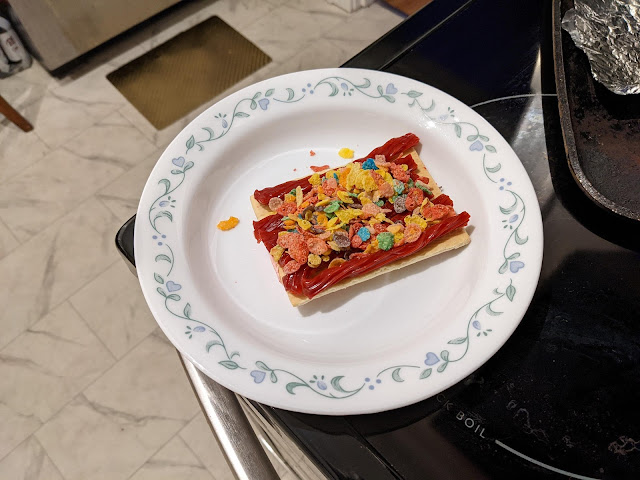
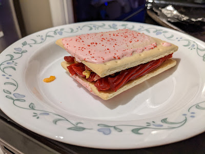
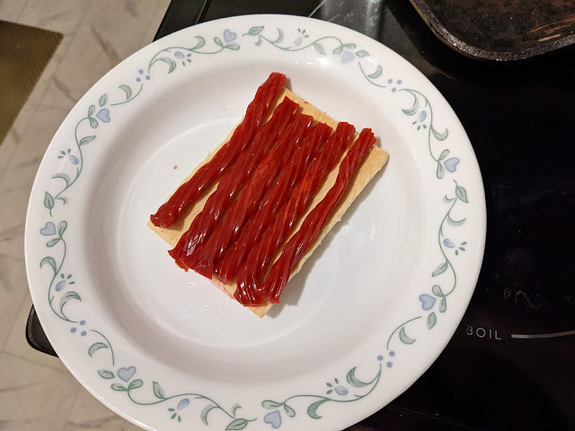
Today's menu item is a Pop Tart Twizzler Sandwich.
Ingredients:
- Pop Tarts or storebrand equivalent (x2 pastries)
- Twizzlers (x3 ropes)
- Fruity Pebbles (1/4 cup cereal)
Happy Eating and remember to come back for more incredible food creations here on Baseball Card Breakfast!