I've really gotten into Topps All-Time Fan Favorites refractors over the past year or so and am starting up a new recurring blog series called Refracting the Past to take a closer look at them.
I think of ATFF as like a "sister set" to Topps Retired. Both saw releases in just 3 years (2003, 2004, and 2005) and don't contain active players. ATFF bridges the gap between the Topps Archives sets that began as mostly reprints, and the modern Topps Archives going strong today that features active players as well. While modern Archives throws players into designs willy-nilly, All-Time Fan Favorites cards tend to use a design for each subject that corresponds with a significant year for that player. So it's kinda like Topps taking a do-over on their old cards. Sometimes the new versions are improvements, other times a step back. The gold foil stamp on all ATFF base cards has always felt a bit like an eyesore to me, perhaps keeping me from paying too much attention to the product line in the past. But then I picked up a couple refractor parallels-- and man, oh man-- I love 'em! I dig shiny cards but care less and less about today's players and today's cards, so shiny cards of greats from the 50s-90s made twenty years ago are right up my alley.
My plan for Refracting the Past is to cover each year of the pre-Chrome Topps era. While I don't think I'll necessarily always go chronologically, this first post in the series starts at the beginning. And it's Monte Irvin's birthday today, so that's good motivation to get this post out of draft purgatory.
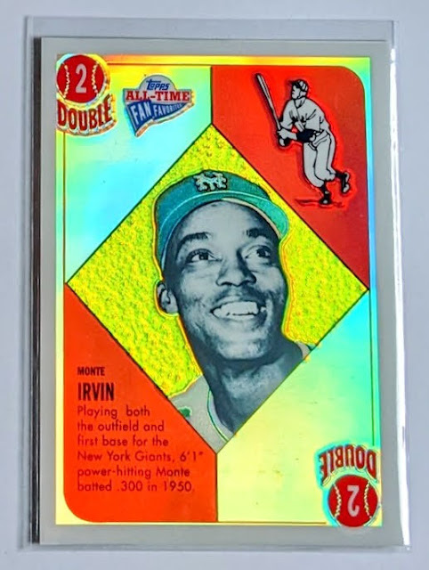 |
| 2005 Topps All-Time Fan Favorites refractors #100 Monte Irvin |
Here's Topps going back in time to 1951, making their best guess at what a '51 Topps game card might look like had refractor printing technology been feasible for bubblegum cards back then, and with the foresight of standardized dimensions.
And hey, I happen to own a real 1951 Topps Monte Irvin card, already shown off on this blog a couple times over the years, so that makes it easy to do a side-by-side comparison:
The smaller size and rounded corners of the original are the most jarring difference. The photos are both black and white headshots with Monte flashing a big smile, though he's looking away in the redo and seems to be a little more excited than he was the first time around. Both game card values are 2/Double and the drawing of the batter and bio blurb are more or less unchanged. While the cards were numbered on the front originally, the refractor wipes away that line from the lower right of the photo area diamond.
My main complaint with the modern version is the non-refracting border that several ATFF refractors suffer from. I still like it a lot, but the card would look better without the unnecessary white border.
The dimensions are closer to matching on the flipside thanks to the small print taking up some extra space on the refractor. Other than being darker than needed, the design here is pretty faithful, with the little equipment drawings looking pretty much identical on both cards. One thing noticeably off is just the "Official" text on the baseballs being faded and tiny. The card number (100) sneaks in at the upper left and the serial number is centered near the bottom. All-Time Fan Favorites cards seem to have their share of uncorrected errors in the back text, as we'll see with this series, but it's not an issue with 1951's standard "deck of cards" back.
Revisiting the 1951 design makes sense here, as
Monte Irvin enjoyed his best post-integration season that year, finishing third in NL MVP voting behind Roy Campanella and Stan Musial while helping the Giants win the pennant. They fell to the Yankees in the World Series, but it was no fault of Monte's, as he hit .458 and tied the World Series record with his 11 hits. He later got a ring with the Giants in '54.
Refractor Report Card
A-
The blocky white borders are my only real complaint here. The photo makes sense in the context of this design, possibly a slight upgrade on the original. The design was decently recreated given the size difference, with no glaring mistakes. Monte Irvin is a worthy subject in the set, evidenced by his spot in Cooperstown.
I'm thankful there are no refractor autos in ATFF or else I'd be tempted to spend a lot of money collecting them. But no, the auto parallels are rainbow foilboard, a poor man's refractor, lol, so I have no problem passing those up. Plus I think those are serial-numbered to only 15 so they can get very expensive. But these non-auto refractors I'm collecting are all /299, making them somewhat scarce but not too financially painful other than maybe the most popular guys. In 2005, they added gold border refractor parallels-- perhaps explaining why non-refracting borders were worked into the design that year; easier to make a parallel of the parallel-- with the gold refractors being numbered out of 25.
Back to Monte, he also has cards in the other two years of Topps All-Time Fan Favorites, sporting a '52 design in 2003 and a '53 design in 2004 before circling back to '51 in 2005. It's worth noting that it's the only 1951 design card in all three All-Time Fan Favorite sets.
I'll likely also incorporate Archives Reserve cards (refractor reprints) into this series, though that product ignored 1951 Topps completely, instead defaulting to 1952 for first Topps card "rookie reprints" even if the guy was also in '51 Topps.
Ok, that's it for this time. Thanks for reading.


I didn't know the ATFF had refractors, that Irvin looks fantastic. (he is a birthday binder guy one of my daughters birthday today and was also my moms).
ReplyDeleteLove the etching on the refractor! But it's hard to beat the original. I remember back in the early 90's seeing unopened packs of 1951 Topps and thinking it'd be cool to buy some and open them, but of course I didn't.
ReplyDeleteThe refractor stopping at the border reminds me of the 1990 Marvel Universe holograms. With the white border showing around the hologram, they always looked like stickers to me, and this Monte does a bit, too.
ReplyDelete