
Once I finally got back into the groove of making customs earlier this year, my first order of business was to make a few cards with bubble-blowing photos for Bob at Best Bubble, whom I needed to thank for some cards he sent me spread over the prior several months.
Usually when I make customs, I'm borrowing a known design, like a classic Topps design or something oddball from the junk era. But I decided to try coming up with a "new" design for this project. That's not my strong suit, but I think the cards came out pretty decent. I like going with 9 cards total for convenient paging.
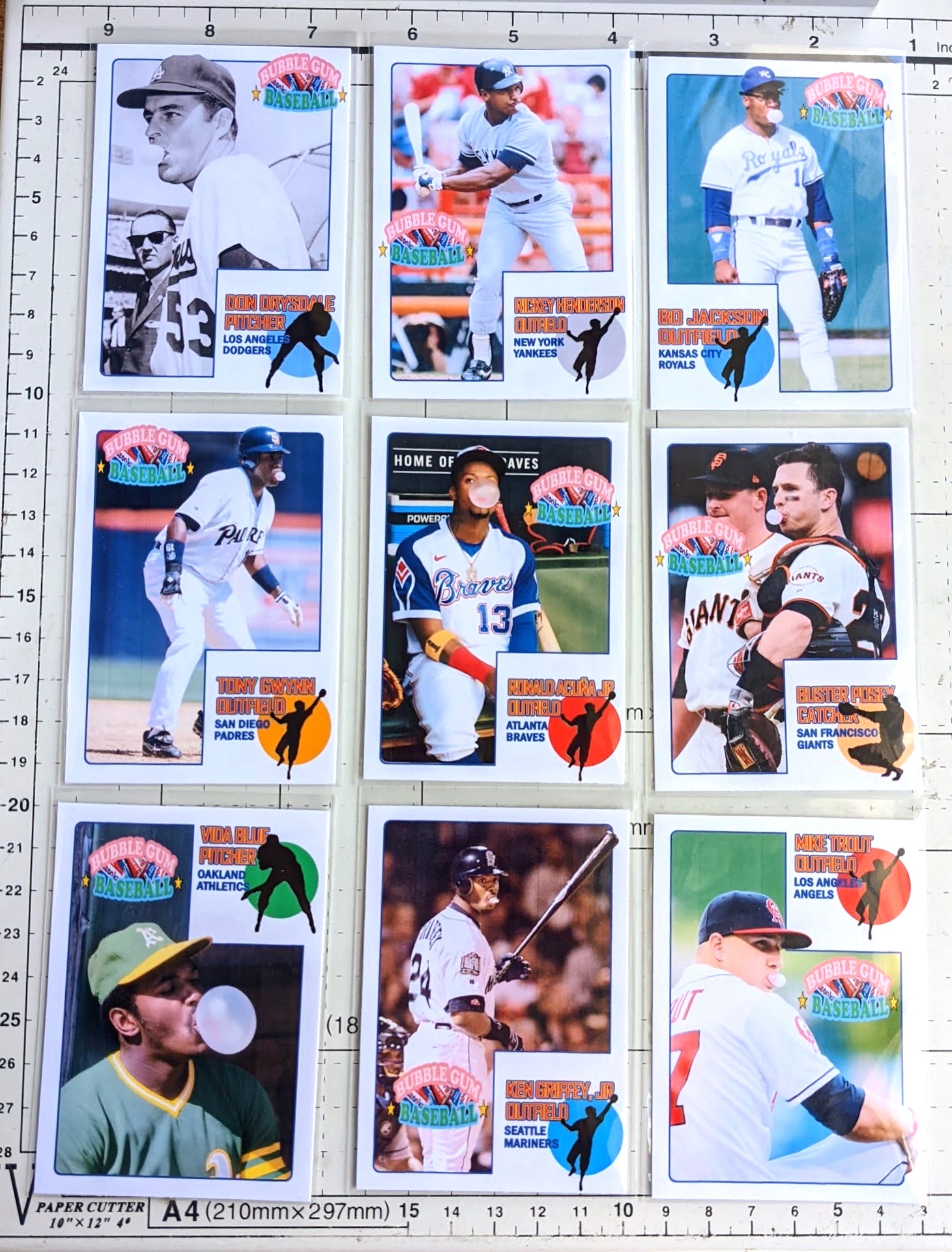
This is a fun group of cards, yeah?
My "new design" ended up looking like more of a mashup, but with the thousands of sets out there at this point, it's not easy to come up with something fresh. Can you identify some familiar aspects? Here's a closer look:

The name plate area is an allusion to the packaging of Big League Chew, while at the same time paying homage to my personal favorite Topps flagship set, 1973. I decided to use the color dot to roughly match team color rather than keep it assigned by position, mainly because I knew I'd end up with several outfielders and I wanted more variety than a bunch of green dots.
The Bubble Gum Baseball logo is a little busy, but it provides all the backstory you need to understand what the set is all about. (I tried seeing how it looked without it, but it made things look a little too straight "1973 Topps" [instead of the subtle "1973 Topps" look I was going for].)
I'm not taking these to a professional printshop or anything, just using photo paper on my streaky old Canon home printer, so they're not perfect-- the digital files look better than the printed versions-- but good enough.

The backs have a little write-up captioning the front picture, often revealing added significance to them, such as the fact that the Trout photo was taken during warm-ups before his very first game in the bigs.
The first 6 of these were made a month or two ago, and then more recently I finished out the page with the bottom 3. My plan is to stop here, at least for this year, but may whip up a "Series 2" next year if there's interest. I would likely tweak the design a bit for future editions, but keeping a similar look.
Want any of these in your own collection? I don't sell customs, but can usually be talked into trading. My top priority at the moment is 1972 Topps baseball. If you've got any 1972 Topps on my wantlist available-- especially high numbers-- I'd be interested in working out a trade with you. I'm still aiming to finish 1972 by the end of the year-- you know, to commemorate its anniversary or whatever-- preferably through trading more than purchasing, and you can expect to see more "trade bait" on the blog fishing for '72s coming up this year. So when you guys go to card shows or whatever, keep an eye out for good deals on '72 high numbers to get and then trade to me! lol
Oh, and there's a special parallel. Get ready for this.
I haven't actually finished creating them yet, but each card theoretically may have a pink parallel. But the color of the border isn't the main draw with these parallels. I think I'm still in the "prototype" stage with these, but if Blogger with cooperate and let me share a video, it'll give you an idea of what I'm going for...
There's a "real bubble"! Let's see Topps or Panini do that! I gotta say, the bubble is fun to play with.. just squeezing it a little and knocking it around for a moment is very satisfying. It'll most likely deflate over time, but my earliest tests from over a couple months ago are still looking just as good, so hopefully plenty of time goes by before the bubble goes flat. I toyed with shoving in a cotton ball to help it keep its integrity long term, but that makes it clumpy and less fun. So I guess I'll just consider them "living" cards that may change over time as the bubble slowly deflates.
These pink parallel bubble cards are a pain to make, so forgive me for being stingy with trading them, but you could pry one away from me if you happen to have '72 Topps superstars I need. (I'd specifically love to score any of these big needs: 49 Willie Mays, 299 Hank Aaron, 300 Hank Aaron IA, 309 Roberto Clemente, 310 Roberto Clemente IA, 550 Brooks Robinson, 559 Pete Rose, 595 Nolan Ryan, 600 Al Kaline, 620 Phil Niekro, 686 Steve Garvey, 695 Rod Carew, 696 Rod Carew IA, 751 Steve Carlton TR, 752 Joe Morgan TR, 754 Frank Robinson TR, 761 Ben Oglivie/Ron Cey RC, 777 Hoyt Wilhelm.)

Thanks!
Very nice.
ReplyDeleteI kind of wish that there were a little pink bubble on each of the 1973 player silhouettes, but I suppose it would be hard to pull off.
Hmm.. maybe an idea for a 2nd series. :)
DeleteNow I'm thinking the design would have gone over better back when I first came up with it a couple months ago. A lot of collectors are probably sick of the '73 silhouette guys at this point thanks to Heritage.
..and Archives just last year.
DeleteThese are super cool, Gavin. Well done!
ReplyDeleteAwesome set Gavin! I'll say it again... please head over to Topps and help them out with card ideas. The "bubble" parallels are ingenious.
ReplyDeleteThose look great! Well done! I think the bubble idea is brilliant!
ReplyDeleteNeat, very neat!
ReplyDeleteHow can I get a set yet?
ReplyDelete